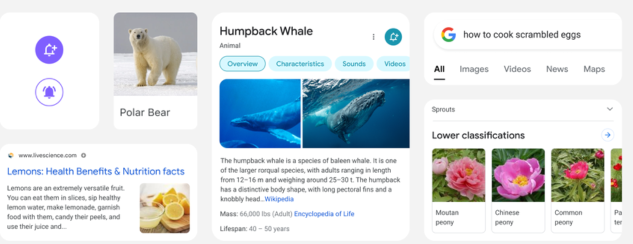
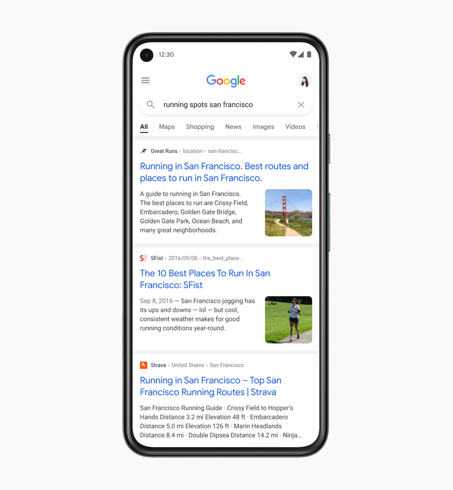
Google is rolling out a new design for its mobile and also desktop search results. While the mobile search changes have been conveyed officially, the tweaks to the desktop searches have not reached that stage, but in all likelihood will be rolled out in phases shortly.
Basically, Google has updated the fonts, shapes, and colors of the search experience. The knowledge panels and the main search result snippets sport a new look.
The whole idea behind the changes is to ensure that the search interface is easier to read while providing a cleaner and more modern experience.
"We wanted to take a step back to simplify a bit so people could find what they’re looking for faster and more easily,” Google designer Aileen Cheng has been quoted as saying in a blogpost.
- IPL beats Corona in Indian Google search
- YouTube watchers in India access it via smartphones
- Alexa is now ready for India, adds Hindi support
- 1 in 3 Indians watch online videos, usually in Hindi
Changes in mobile search

Google has listed out the changes and the reasons for them.
Info in focus: “We want to let the search results shine, allowing people to focus on the information instead of the design elements around it," says Aileen. “It’s about simplifying the experience and getting people to the information they’re looking for as clearly and quickly as possible."
Easier to read: “We’re making the result and section titles bigger, as well," Aileen says. The update also includes more of Google’s font, which already shows up in Android and Gmail.
More room: “We decided to create a new edge-to-edge results design and to minimize the use of shadows, making it easier to immediately see what you’re looking for," says Aileen.

Using colour to highlight: The re-design team focused on centering content and images against a clean background and using colour more intentionally to guide the eye to important information without being overwhelming or distracting.
And finally, the “Googley" feeling: “If you look at the Google logo, you’ll notice there’s a lot of roundness to it, so we’re borrowing from that and bringing it to other places as well," says Aileen. You’ll see that in parts of this redesign, like in rounded icons and imagery.
Changes in desktop searches
Google seems to be taking this philosophy to its desktop search results pages, too.
The respected Google-related news site, 9to5Google, is reporting that on the desktop the first change sees "the search field always raised above the rest of the page. Previously, this elevation only occurred when you hovered over. Google has dropped the thin outline around the pill for a much more visually distinguished element."
It adds that the company’s exclusive font, Google Sans, "is now leveraged for page names and Search controls, like the filter bar. It was previously only used for some section headers, and this expanded adoption is particularly noticeable."
from TechRadar - All the latest technology news https://ift.tt/3sWJ4xg
Aucun commentaire: